
Test Objective: When redesigning the Desktop app, we were faced with the challenge of how to design and place the “new chat” button to ensure that the button is easy for users to find, while not being too distracting. We wanted to test five possible designs to see which fulfilled this need the best.
Methodology: We used a remote, unmoderated first click test to gauge whether users would find the correct target/button and how long it took them. Each test had about 65 non-customer participants, all recruited from Mechanical Turk. We chose non-customers so that they would focus at the task at hand rather than be distracted by their previous knowledge of the product.
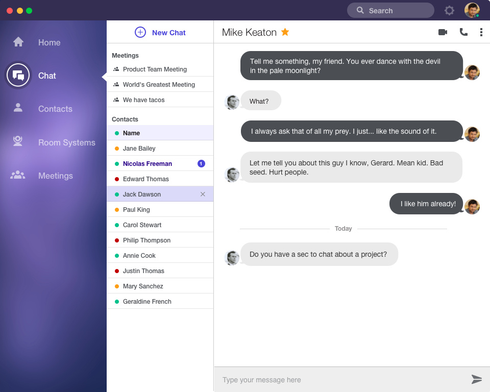
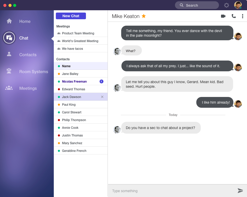
The Five Designs:
![]()
![]()
![]()
![]()
![]()
The Test: Each participant was asked to read the instructions on how to complete a first click test before beginning the following tasks:
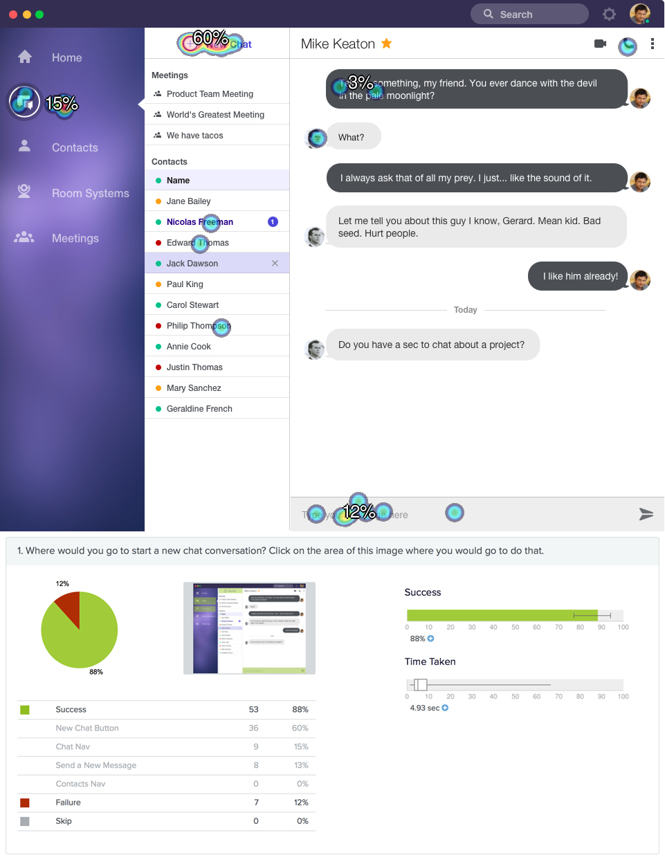
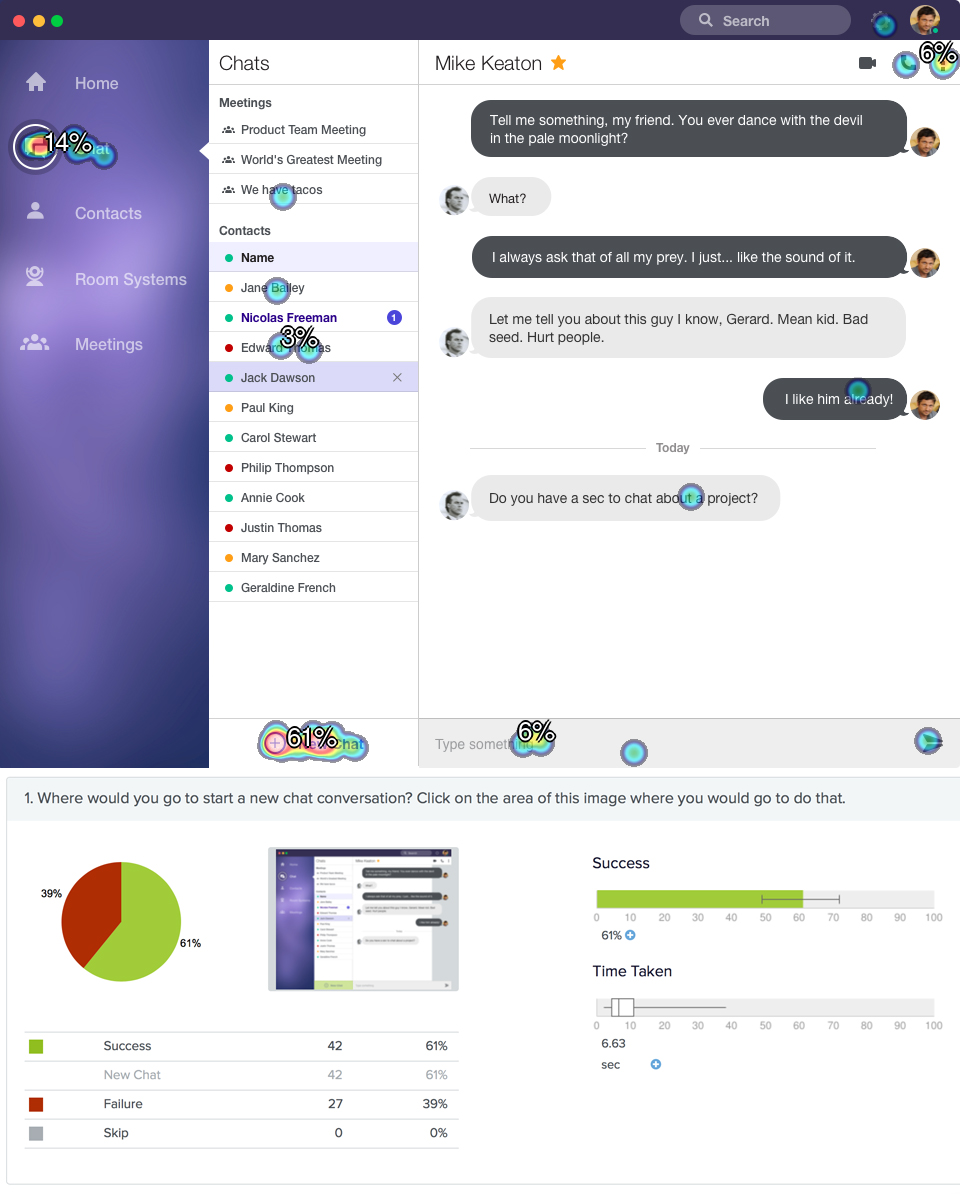
1. Where would you go to start a new chat conversation Click on the area of this image where you would go to do that.
2. Click on the star next to Mike Keaton's name. *
* This task was used as a "speed trap" so we could see if participants were just blindly clicking in order to get paid.
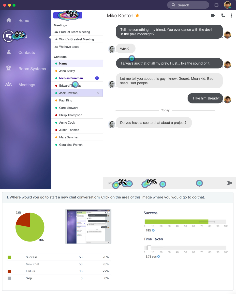
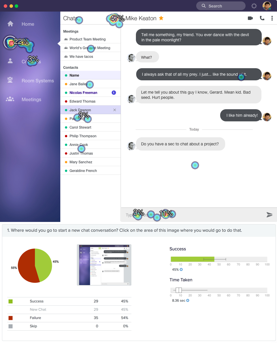
The Results: For each test, we reviewed the heat map of where participants thought to click to create a new chat and how long it took them to make that decision.
![]()
![]()
![]()
![]()
![]()
The Chosen Design:
![]()
We will use this version and play with the alignment of the new chat button. We chose to have this button because it is consistent with other "Create New" buttons in the app and because it is easy to see, find, and understand. We chose the placement because it let the user stay in the top portion of the screen, putting them already in the area to type in the recipient. Having the button at the bottom would force the user to travel all the way to the top of the screen and then back down to the bottom to type a message, creating a jarring experience.
Methodology: We used a remote, unmoderated first click test to gauge whether users would find the correct target/button and how long it took them. Each test had about 65 non-customer participants, all recruited from Mechanical Turk. We chose non-customers so that they would focus at the task at hand rather than be distracted by their previous knowledge of the product.
The Five Designs:


The Test: Each participant was asked to read the instructions on how to complete a first click test before beginning the following tasks:
1. Where would you go to start a new chat conversation Click on the area of this image where you would go to do that.
2. Click on the star next to Mike Keaton's name. *
* This task was used as a "speed trap" so we could see if participants were just blindly clicking in order to get paid.
The Results: For each test, we reviewed the heat map of where participants thought to click to create a new chat and how long it took them to make that decision.

The Chosen Design:
We will use this version and play with the alignment of the new chat button. We chose to have this button because it is consistent with other "Create New" buttons in the app and because it is easy to see, find, and understand. We chose the placement because it let the user stay in the top portion of the screen, putting them already in the area to type in the recipient. Having the button at the bottom would force the user to travel all the way to the top of the screen and then back down to the bottom to type a message, creating a jarring experience.