
Test Objective: We conducted this study because of customer feedback that when guest users are invited to join a meeting and arrive at the call me page to determine how to join the call, they cannot find information on other ways to join the call. A common use case was that users wanted to call in from third party devices or Skype for Business, and could not figure out how to do so since those options aren't emphasized on the current page. This frustrated users and provided an overall negative experience. We believe that making the "Downloads and other ways to call in" section more prominent and easier to access will help users understand how to access their desired method.
Methodology: We used a remote, unmoderated task-based usability test with a think aloud protocol. This method allows us to test if participants can find and perform specific actions, while getting an insight to their thought process. Since we are concerned with users understanding and finding that there are other ways to call in, it is especially valuable to see and hear what how participants interpret and navigate the Call Me Page.
We tested three possible designs and ran an identical test on the current design as a baseline. For each test we recruited five non-customers from TryMyUI. We chose non-customers to approximate non-customer guest callers who are the audience of the Call Me Page.
The Test: Participants were asked to read the test frame of mind scenario before beginning the tasks, followed by completing test tasks while thinking aloud. For the proposed redesigns, participants were also asked to read a message about the limitations of a prototype. Because of issues with TryMyUI and participants grasping the limitations of the prototype, how we presented this message changed throughout the three tests.
Participants were told to “pretend [that they] are at work and [they] receive an invitation to partake in a video conference. [They] click on the link and arrive at this page." Participants were then asked to perform these tasks:
1. Before you click anything, please describe what actions are available to you.
2. You would like to call in via the speakerphone in your office. Please speak aloud what United States number you would dial to call in.
Afterwards, participants were asked if there was anything they found confusing.
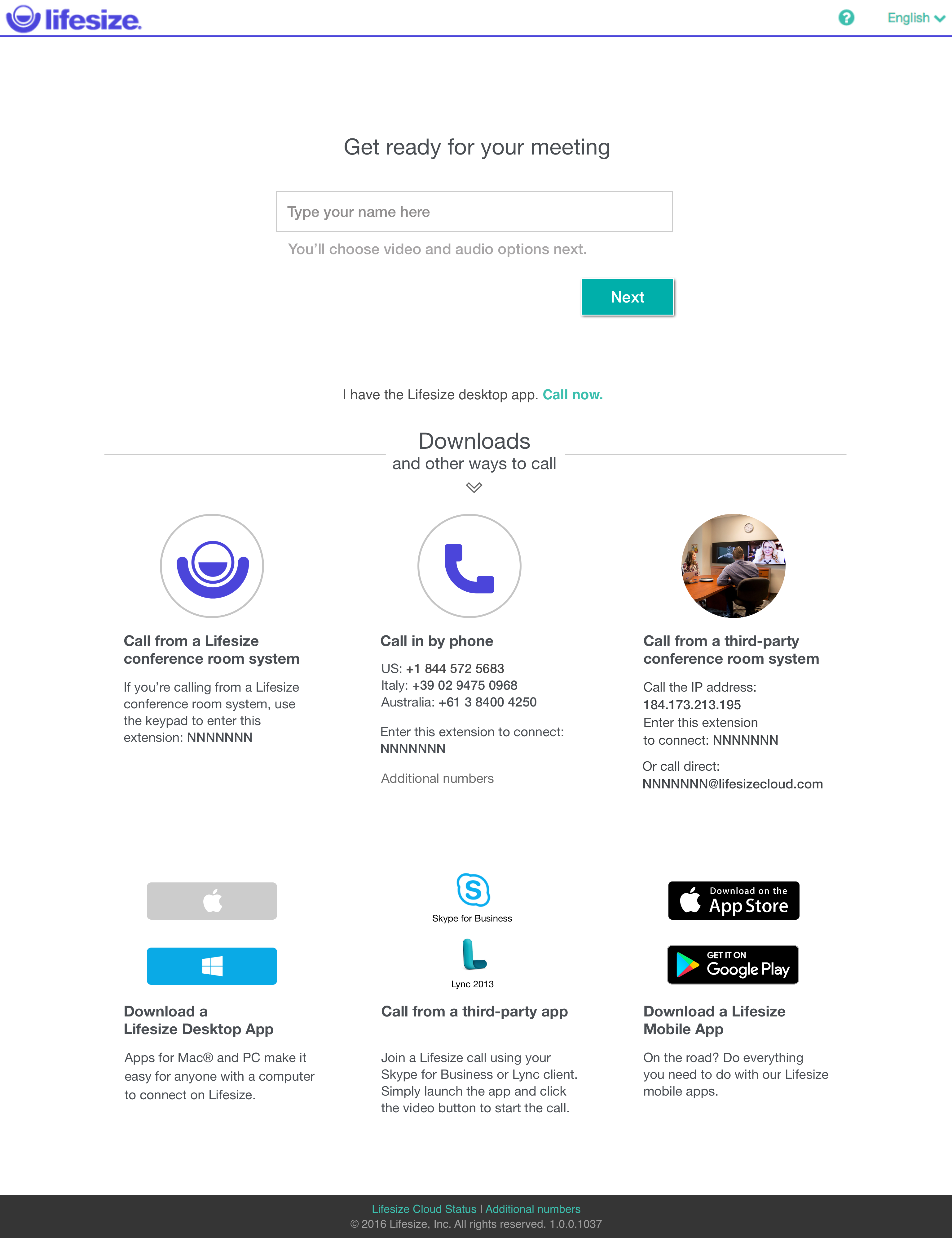
The Current Page:
![]()
Version One:
![]()
Version Two:
![]()
![]()
Version Three:
![]()
![]()
How The Current Design Held Up 0 of 3 testers* were able to correctly complete the task
Overall, the current design completely misled users. While they noticed the "Downloads and other ways to call" text in the beginning, it wasn't obvious to them in the second task that it could lead to the correct answer. Instead, each user went down the Join Flow and found phone numbers in the "Choose your audio" section. In their post test questionnaire, however, testers said they found it straight forward. This experience in the current design, highlights how easy it is to make a mistake and have no idea (or way) to remedy it.
It is fairly common to find that users' self-reported behavior differs from what they actually do; in other words they can believe a task was easy to complete, while failing the task. To learn more about this phenomena visit http://www.measuringu.com/failed-sat.php or https://www.nngroup.com/articles/first-rule-of-usability-dont-listen-to-users/.
Version One Key Themes Uncovered: 3 of 5 testers were able to correctly complete the task
- Few of the testers scrolled past the first row of options in the "Downloads and other ways to call" section, meaning they never saw the other download options. Not seeing the other downloads options confused users a bit since that was heavily emphasized in the title.
- Two testers, expressed that they were "maybe" right or guessing when clicking on downloads and other ways to call.
- One tester knew the downloads and other ways to call was there, but did not think that would lead to the correct answer. This may have been because of how Downloads and other ways to call was emphasized or the tester's general confusion over "United States Phone Number".
- To one tester, the close proximity of the "I have the app. Call Now" link to the "Downloads and other ways to call" created the appearance that the functionality of the two were related or the same.
- Even though the testers had gotten the task correct, they second guessed themselves a little. Some of this uncertainty was due to a lack of understanding over what constitutes a "third party conference room".
Recommendations for Version Two - Change the "Downloads and other ways to call text". It emphasizes downloads and downloads are the last options. Testers found it misleading when they were looking for other ways to call in.
- Potentially put more space in-between "Downloads and other ways to call" and the "I have the app. Call Now" link.
- Make the pictures, such as the third party conference rooms and Lifesize conference rooms, more representative of what they refer to. Testers seemed to rely on them to figure out what they wanted to do.
Version Two Key Themes Uncovered:
2 of 5 testers were able to correctly and intentionally complete the task.
- There was some uncertainty whether or not clicking on different ways to call would help them or if it was even a link.
- 4 of 5 testers only considered clicking or interacting with different ways to call because typing in their name and clicking next didn't work.
- Two testers seemed to not see different ways to call at first. One tester noticed it after trying to type their name in. The second tester never noticed it.
- When testers clicked on different ways to call, they easily found the desired information.
Recommendations for Version Three 2 of 5 testers were able to correctly and intentionally complete the task.
- There are still some issues with users noticing "different ways to call in" and knowing its clickable. Therefore we should do more to emphasize that it is a link. Separating it from the call in using the app and making the whole text look like a link should help.
- Call in using the app was highly noticeable to users and seemed to overpower the area. Maybe try making it smaller and move it closer to the next button since it is a similar action.
Version Three Key Themes Uncovered: - 4 of 5 testers noticed "different ways to call in" and interpreted it as something clickable.
- The two testers who completed the task correctly, were confident in clicking on different ways to call in.
- The tester who clicked ahead, while his results are invalid, he was very confident about his understanding and clicking on different ways to call in.
- When testers clicked on different ways to call, they easily found the desired information.
The design that we will implement:
![]()
![]()
Methodology: We used a remote, unmoderated task-based usability test with a think aloud protocol. This method allows us to test if participants can find and perform specific actions, while getting an insight to their thought process. Since we are concerned with users understanding and finding that there are other ways to call in, it is especially valuable to see and hear what how participants interpret and navigate the Call Me Page.
We tested three possible designs and ran an identical test on the current design as a baseline. For each test we recruited five non-customers from TryMyUI. We chose non-customers to approximate non-customer guest callers who are the audience of the Call Me Page.
The Test: Participants were asked to read the test frame of mind scenario before beginning the tasks, followed by completing test tasks while thinking aloud. For the proposed redesigns, participants were also asked to read a message about the limitations of a prototype. Because of issues with TryMyUI and participants grasping the limitations of the prototype, how we presented this message changed throughout the three tests.
Participants were told to “pretend [that they] are at work and [they] receive an invitation to partake in a video conference. [They] click on the link and arrive at this page." Participants were then asked to perform these tasks:
1. Before you click anything, please describe what actions are available to you.
2. You would like to call in via the speakerphone in your office. Please speak aloud what United States number you would dial to call in.
Afterwards, participants were asked if there was anything they found confusing.
The Current Page:

Version One:
Version Two:


Version Three:


How The Current Design Held Up 0 of 3 testers* were able to correctly complete the task
Overall, the current design completely misled users. While they noticed the "Downloads and other ways to call" text in the beginning, it wasn't obvious to them in the second task that it could lead to the correct answer. Instead, each user went down the Join Flow and found phone numbers in the "Choose your audio" section. In their post test questionnaire, however, testers said they found it straight forward. This experience in the current design, highlights how easy it is to make a mistake and have no idea (or way) to remedy it.
It is fairly common to find that users' self-reported behavior differs from what they actually do; in other words they can believe a task was easy to complete, while failing the task. To learn more about this phenomena visit http://www.measuringu.com/failed-sat.php or https://www.nngroup.com/articles/first-rule-of-usability-dont-listen-to-users/.
Version One Key Themes Uncovered: 3 of 5 testers were able to correctly complete the task
- Few of the testers scrolled past the first row of options in the "Downloads and other ways to call" section, meaning they never saw the other download options. Not seeing the other downloads options confused users a bit since that was heavily emphasized in the title.
- Two testers, expressed that they were "maybe" right or guessing when clicking on downloads and other ways to call.
- One tester knew the downloads and other ways to call was there, but did not think that would lead to the correct answer. This may have been because of how Downloads and other ways to call was emphasized or the tester's general confusion over "United States Phone Number".
- To one tester, the close proximity of the "I have the app. Call Now" link to the "Downloads and other ways to call" created the appearance that the functionality of the two were related or the same.
- Even though the testers had gotten the task correct, they second guessed themselves a little. Some of this uncertainty was due to a lack of understanding over what constitutes a "third party conference room".
Recommendations for Version Two - Change the "Downloads and other ways to call text". It emphasizes downloads and downloads are the last options. Testers found it misleading when they were looking for other ways to call in.
- Potentially put more space in-between "Downloads and other ways to call" and the "I have the app. Call Now" link.
- Make the pictures, such as the third party conference rooms and Lifesize conference rooms, more representative of what they refer to. Testers seemed to rely on them to figure out what they wanted to do.
Version Two Key Themes Uncovered:
2 of 5 testers were able to correctly and intentionally complete the task.
- There was some uncertainty whether or not clicking on different ways to call would help them or if it was even a link.
- 4 of 5 testers only considered clicking or interacting with different ways to call because typing in their name and clicking next didn't work.
- Two testers seemed to not see different ways to call at first. One tester noticed it after trying to type their name in. The second tester never noticed it.
- When testers clicked on different ways to call, they easily found the desired information.
Recommendations for Version Three 2 of 5 testers were able to correctly and intentionally complete the task.
- There are still some issues with users noticing "different ways to call in" and knowing its clickable. Therefore we should do more to emphasize that it is a link. Separating it from the call in using the app and making the whole text look like a link should help.
- Call in using the app was highly noticeable to users and seemed to overpower the area. Maybe try making it smaller and move it closer to the next button since it is a similar action.
Version Three Key Themes Uncovered: - 4 of 5 testers noticed "different ways to call in" and interpreted it as something clickable.
- The two testers who completed the task correctly, were confident in clicking on different ways to call in.
- The tester who clicked ahead, while his results are invalid, he was very confident about his understanding and clicking on different ways to call in.
- When testers clicked on different ways to call, they easily found the desired information.
The design that we will implement: