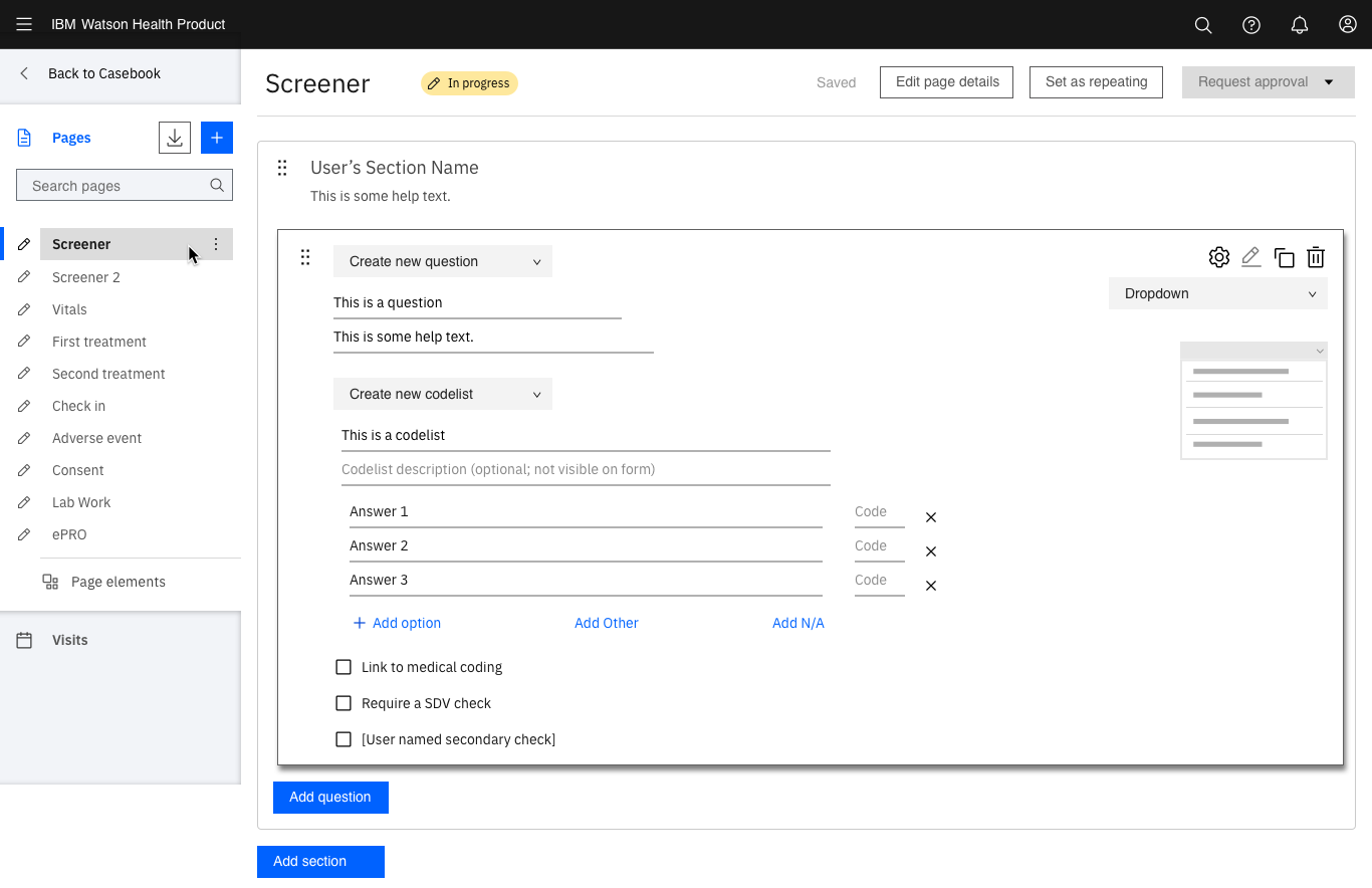
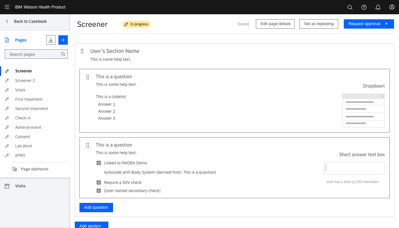
Form Building
MY OBJECTIVE:
To redesign the form building experience to match ODM standards and enable users to easily build complex forms with a high degree of flexibility.
MY CONTRIBUTIONS:
I led the UX, initial testing, UI, and Content design efforts.
In later testing, I supported the conduct and synthesis.
AT THE SAME TIME:
Study Designer Reseach
Domain Deep Dive
Process Building
USER:
Study Designer
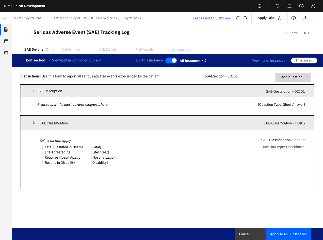
What is form building?
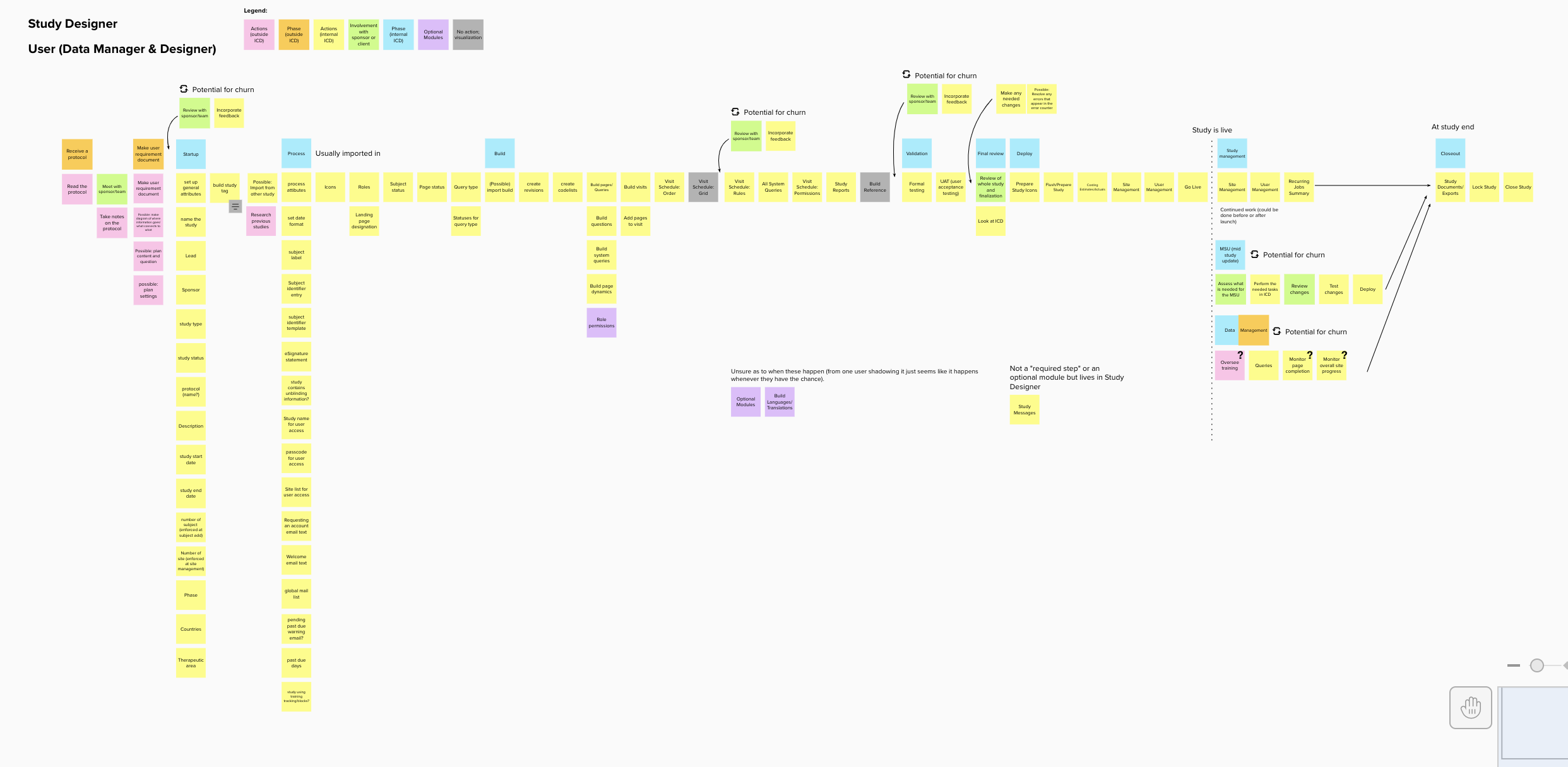
Form building references the process of building the means of data collection for a study. When a trial is being conducted, each site is given a set of forms with data points to record. Forms are organized into events and filled out based on a schedule of events set by the protocol. Building out the schedule of events and anticipating data collection challenges are the Study Designer’s main focus and is critical to the success of a study.
Spoiler Alert:
After two full requirements rewrite, three and a half full redesigns (with many, many iterations inbetween), and four rounds of usability tests, we finally had a form building process that the entire team was confident in. MORE HERE WITH IMAGES
Impact:
While the product is still in development, the Form Building work had a tremendous impact on the internal team.
From a cross functional perspective:
- The experience served as an introduction to design thinking and working with designers.
-
The opportunity helped expand mindsets and equipped them to be active players in the design process.
- The teams learned how to work together and understand when we were truly aligned on a direction.
- The project served as the foundation of trust between teams.
- Development fully bought into the decisions made and defended them to newer developers.
From a design perspective:
- It helped us establish the underlying statergies that were the crux of the entire ICD 2 experience.
- The patterns and structures created accelerated future design work.
- It enabled us to establish and apply our domain knowledge; illustrating that we understood how to build a study enough to abstract and translate it into alternative workflows.
- Since the problems we were solving were the first of it’s kind at IBM, we were able to take what we built and share it out with the IBM Design community.
From an user perspective:
- Customers were excited to see the new work and enjoyed being a part of the process.
- “It looks pretty good... it’s pretty easy. I don’t know what would make it easier to be perfectly honest.” A user during testing
- “I don’t really see any confusing things. It looks pretty clear and straightforward. I’m not searching through the UI so really good impression... It looks great. Kudos.” Another user during testing
While it may not have always been easy, the work done on form building was crucial in our development as a team and in enabling future success.
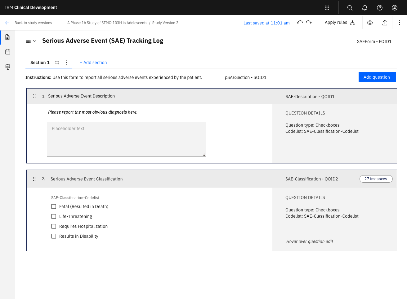
ODM, what’s the big deal?
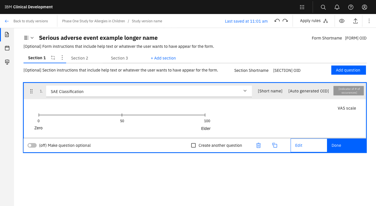
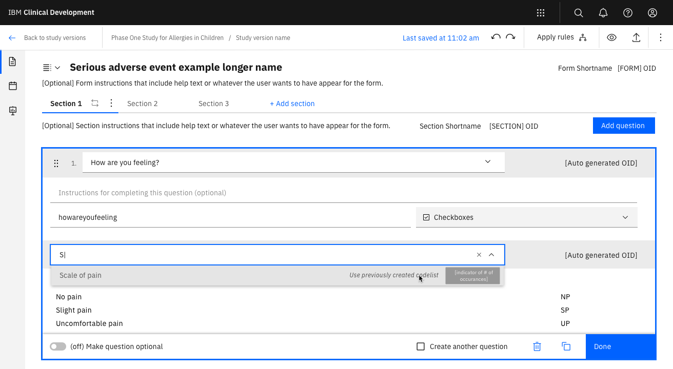
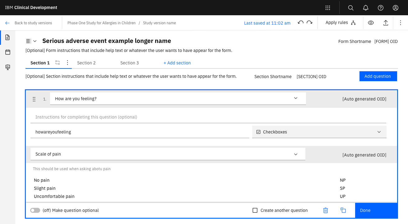
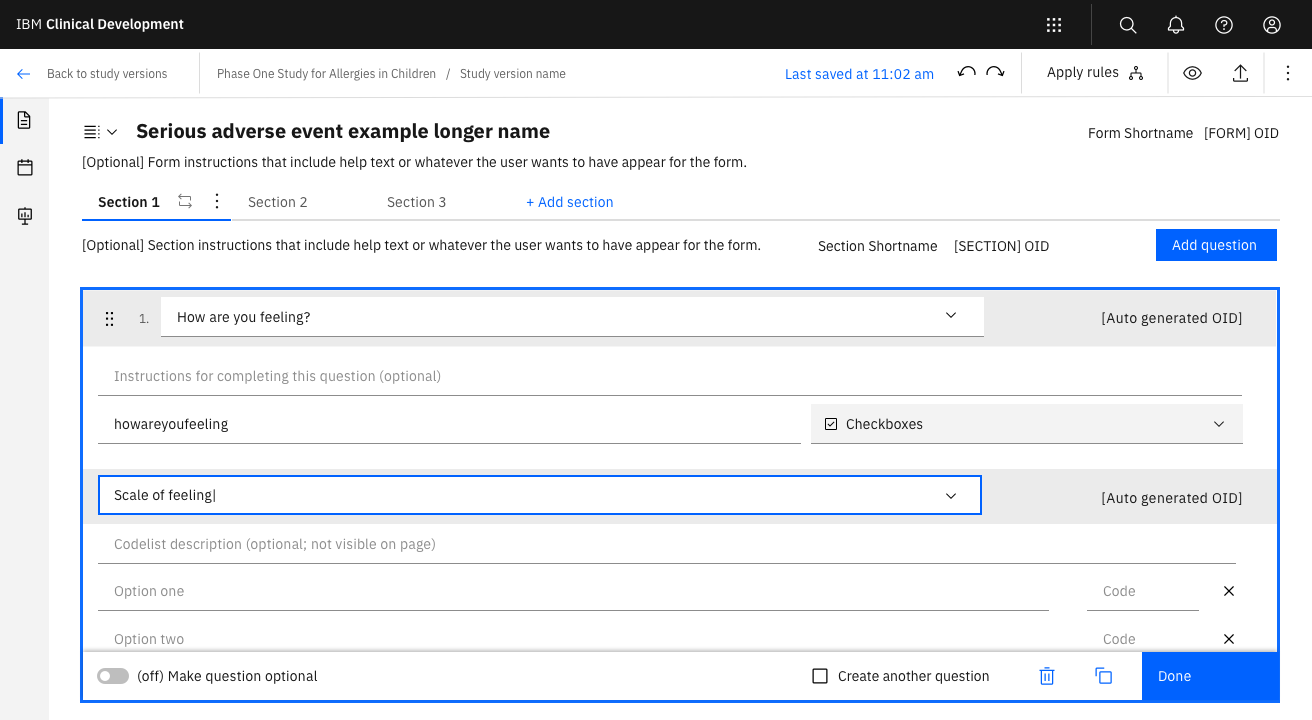
The ODM (operational data model) structure is a platform-independant data format used for more efficient exchanging and storing of clinical data. When it comes to study building, ODM allows for study designers to create data collection elements that can be reused across the study and updated from a single source. With hundreds of data points in a study, being able to easily make percise changes to a singular question with confidence those changes will appear where that question is reused and won’t cause disruptions to the data is a huge relief to the Study Designer.
Sounds simple, right? While that’s true from a coding perspective, from a user perspective it can be unnecessarily complex. The three most difficult aspects to navigate were:
From a backend perspective, we were locked in. We had to maintain the integrity of the ODM structure.
The ODM (operational data model) structure is a platform-independant data format used for more efficient exchanging and storing of clinical data. When it comes to study building, ODM allows for study designers to create data collection elements that can be reused across the study and updated from a single source. With hundreds of data points in a study, being able to easily make percise changes to a singular question with confidence those changes will appear where that question is reused and won’t cause disruptions to the data is a huge relief to the Study Designer.
Sounds simple, right? While that’s true from a coding perspective, from a user perspective it can be unnecessarily complex. The three most difficult aspects to navigate were:
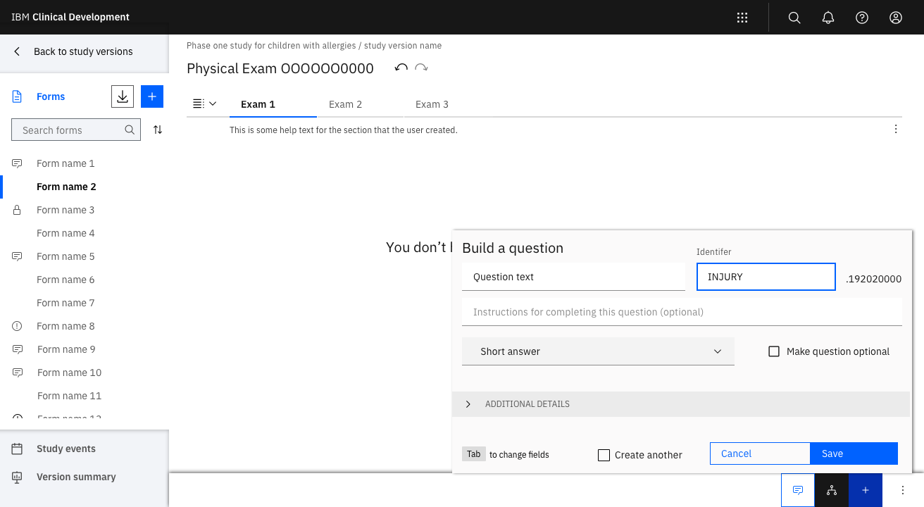
- Each data collection element had strict requirements and the difference between each element type was hard to discern.
- The structure introduced the concept of Sections and required their use, regardless of Study Designer preference.
- Editing reuable data collection elements introduced the complexity of allowing Study Designers to decide how vastly their edits could be applied. Combined with the strict definitions of each element, Study Designers could easily get lost when trying to determine what element should be edited and the impact of those changes.
From a backend perspective, we were locked in. We had to maintain the integrity of the ODM structure.

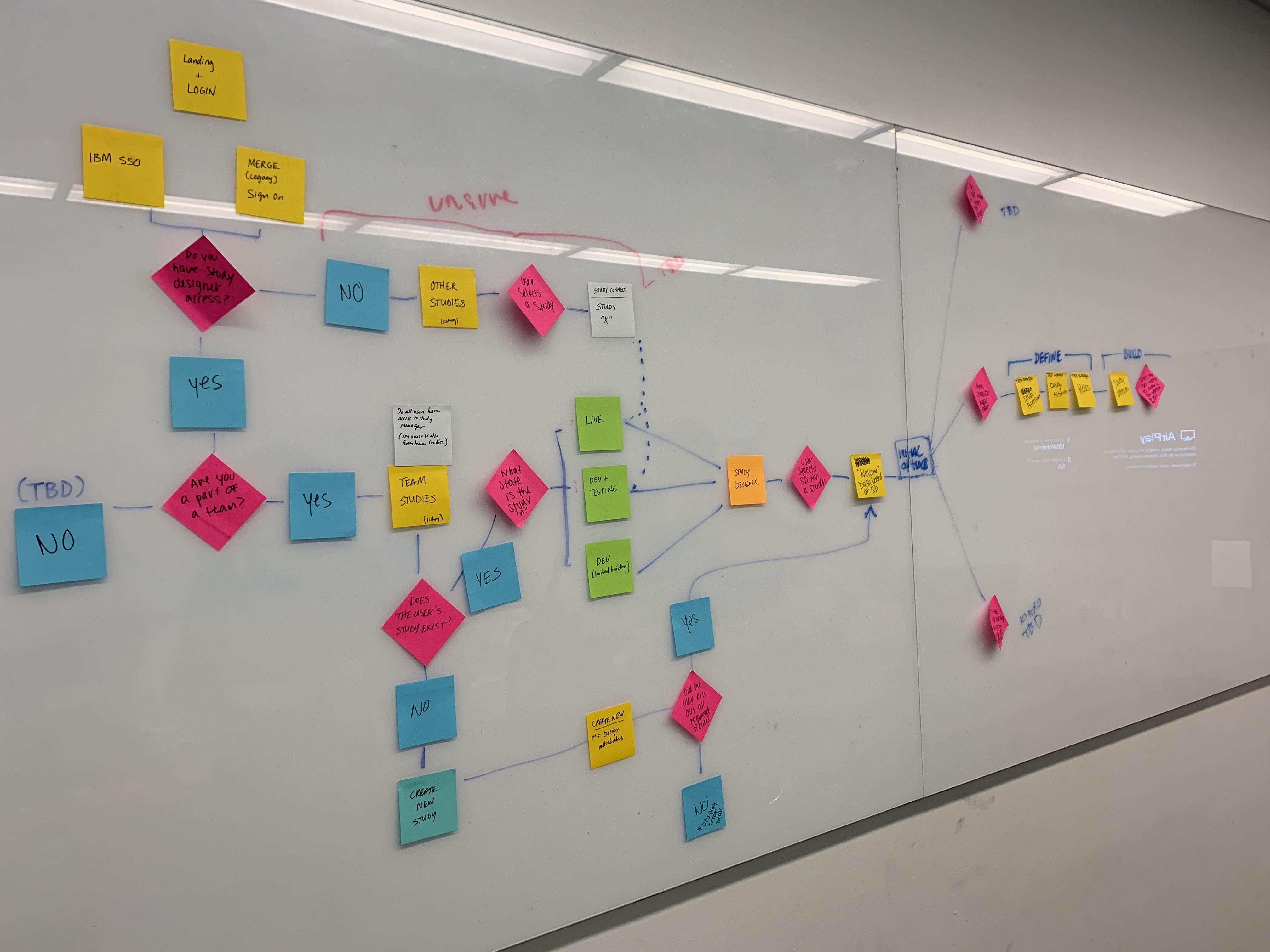

The question then became, how do we create an experience that enables users to easily build within the confines of ODM and manage the complexity?


Initial Ideation
Once I understood the ODM structure and requirements for each data collection element, I began to ideate building strategies. First, I examined form builders from various industries to see how they deal with complexity and any other strategy take aways. Alongside my market research, I took time to examine the experience stategy in the current product, development design decisions in the ODM prototype, and customer feedback. From these efforts, I uncovered that customers found it disorienting to jump between multiple sections when building, it was difficult to picture the final output, and they frequently lost the context of where they were in the process. And when I looked at other EDCs, I found that they utlized the same experience strategies as the current product and resulting in the same issues. While the other form builders in the market, such as Google Forms, utilized opposing strategies as the EDCs, they didn’t deal with nearly the same level of complexity as ODM. So where did that leave me?
From these learnings, I was able to form initial guidelines for my designs:
1. Prevent section jumping by enabling users to build in one place whenever possible
2. Allow users to easily keep their context of where they are in the product and in what they’ve built
3. Lessen cognitive load by introducing progressive disclosure
4. Allow for multiple mental modals of building
5. Maintain clear boundaries between ODM components while enabling users to build as if the boundaries didn’t exist
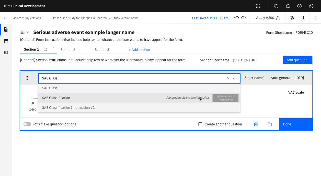
6. Give users the flexibility to switch between creating a new component and reusing a previously made component whenever they want (this was more of a requirement rather than a principle).
These guidelines, along with the insights and principles later generated by the study designer persona research, aided my initial exploration and enabled me to come up with an initial form building experience to test.
Once I understood the ODM structure and requirements for each data collection element, I began to ideate building strategies. First, I examined form builders from various industries to see how they deal with complexity and any other strategy take aways. Alongside my market research, I took time to examine the experience stategy in the current product, development design decisions in the ODM prototype, and customer feedback. From these efforts, I uncovered that customers found it disorienting to jump between multiple sections when building, it was difficult to picture the final output, and they frequently lost the context of where they were in the process. And when I looked at other EDCs, I found that they utlized the same experience strategies as the current product and resulting in the same issues. While the other form builders in the market, such as Google Forms, utilized opposing strategies as the EDCs, they didn’t deal with nearly the same level of complexity as ODM. So where did that leave me?
From these learnings, I was able to form initial guidelines for my designs:
1. Prevent section jumping by enabling users to build in one place whenever possible
2. Allow users to easily keep their context of where they are in the product and in what they’ve built
3. Lessen cognitive load by introducing progressive disclosure
4. Allow for multiple mental modals of building
5. Maintain clear boundaries between ODM components while enabling users to build as if the boundaries didn’t exist
6. Give users the flexibility to switch between creating a new component and reusing a previously made component whenever they want (this was more of a requirement rather than a principle).
These guidelines, along with the insights and principles later generated by the study designer persona research, aided my initial exploration and enabled me to come up with an initial form building experience to test.
Baby’s First Usability Test
As the we fleshed out an experience strategy and wireframes, the cross functional team and I began compiling a list of questions to investigate. Did users see the difference between the ODM components? Was it clear that users could reuse previously made components or did it seem like they were just duplicating those components? We knew that section jumping was something we wanted to avoid, but how would users react to the bulk of building occurring in one place? While the team was aligned that we did not want to simply reskin the legacy product, we weren’t yet fully aligned on how much of a depature there should be. The cross functional team wanted “proof” that the design lead was a wise move. No pressure.
I introduced usability testing as a means to maybe get that “proof”. More importantly, I wanted to illustrate how usability testing could help us answer some our questions, reveal insights about how our users work, and that the right new approach would be embraced by users. But first I had to explain why we needed to throw away this notion of being “right”. I worked with the cross functional team to view our current design as a proposal and it failing the usability tests was still positive forward movement. While liking the idea of testing, they were nervous about the time investment required. Especially since we found that our testing objectives couldn’t be fulfilled with a click through prototype; that in order to convey the intricacies of the system and have users build as naturally as possible, we needed a front end developer to help build a realistic prototype. To help ease concerns and provide insight into the process, I conducted mock usability tests with the team. Immediately, the cross functional team saw the value of the activity and investiment. They enjoyed the experience so much that they asked me conduct the mock tests with the broader development team.
With the team aligned on the activity and the why behind it, we were able to begin. Instead of giving participants written out individual prompts, we gave them what they were used to seeing at the start of a build: an user requirement document. Our hope was that this method would allow us to observe how partipants would naturally approach the system, rather than test if they understood our instructions. {talk more about conduct?]
Overall, we found that participants were able to successfully build with minimal issues. Participants reported that the experience was easy to use and that they liked the changes from the legacy product. However, the concerns that participants raised about how the system would scale and some workflow ideas prompted us to rethink some of the designs.

The “user requirements” we gave to participants
Videos of the prototype used
But most importantly, this experience strengthened the growing trust between my cross functional partners and I; that design thinking provided value, that we would make decisions based on data, and that our new strategies were worth the risk.


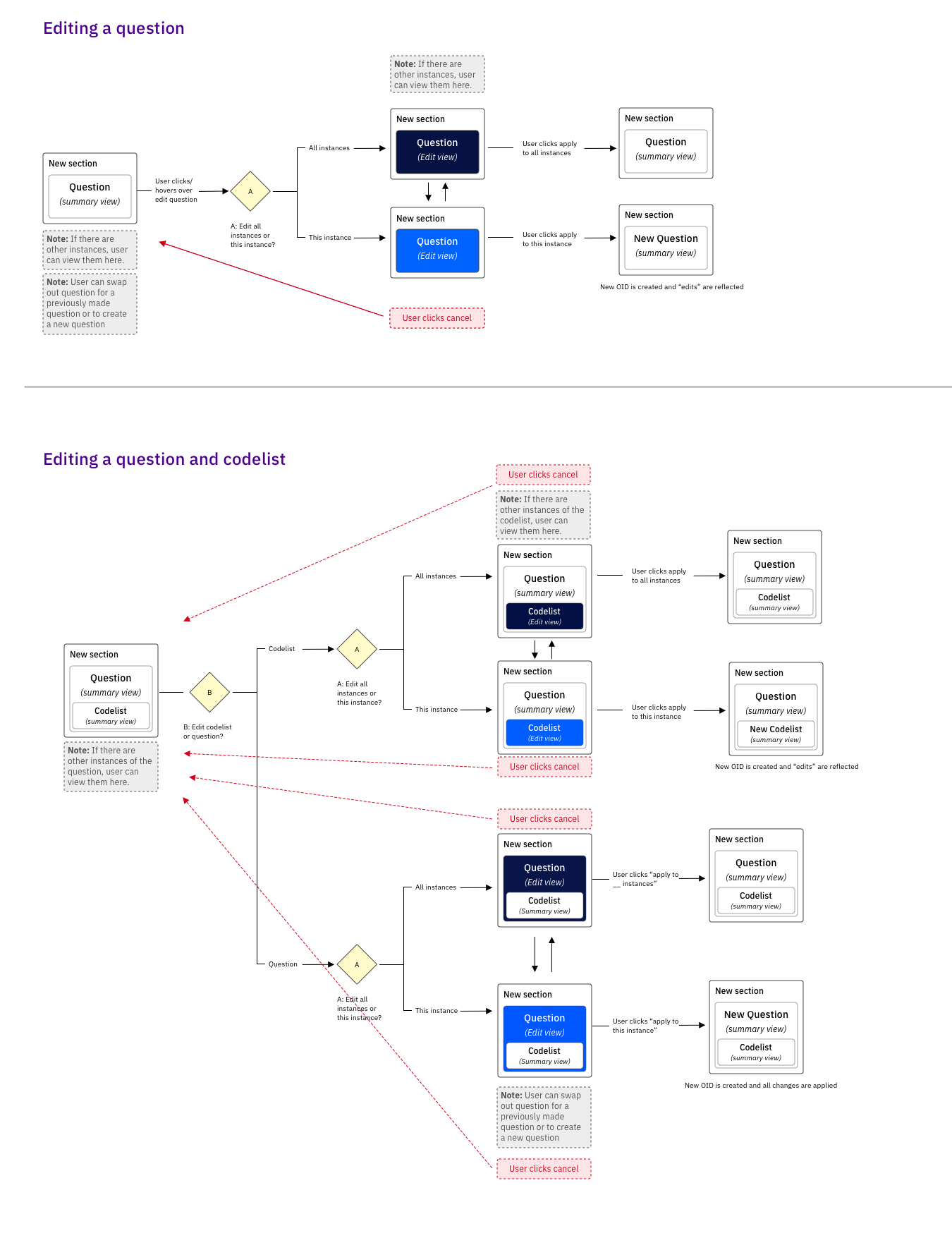
Chapter 4: New Teammates and The Challenge of Vertical Spacing
While implementing the insights from testing, several new challenges arose that tested our designs and the cross functional team. Over night, the design team doubled. While this was great news, it meant that I needed to onboard our new members and ensure alignment on our design strategies. At the same time, our cross functional partners were beginning to fully realize what deviating from ICD1 design strategies entailed. Specifically, they were concerned with fitting less within view and how that might slow Study Designers down. This combined with the new points of view on the design team, kicked off a sprint to ideate on alternative flows that prioritized horizontal space and building speed. Ultimately the designs realtively the same, but the iteration allowed the entire team to explore every option and feel that we had chosen the best one.


The second challenge was building a cohesive edit experience that was scalable across the entities and made it clear to the user that they were making edits that could apply in multiple places. The original stategy, to edit in a library, was starting to raise concerns that users would find it disorienting. As we ideated on alternative strategies, it became clear that users also needed a clear way to edit a single instance of an entity. And thus kicking off a new phase of the project called...
“We know that you’re right, but maybe we can have users hack it for now.”
Proving It, Again
The “hack it” mindset along with how torn we were between editing strategies meant there was a clear next step: to put it all to the test.
The design team started by conducting a preference test where participants performed various edit tasks with several different experiences: completely in form building context, in a library, a new tab, and a “hack-y” workaround. Upon examining participants task completion rates, the ease in which they completed the tasks, and their stated preferences, we found that users overwhelimingly preferred editting in context and consistently failed when having to rely on the “hacks”. While this wasn’t what our cross functional partners wanted to hear, the data made them feel confident that we were moving forward with the best possible solution.
Was this the end? Could we finally start focusing on the visual design? No, not exactly...
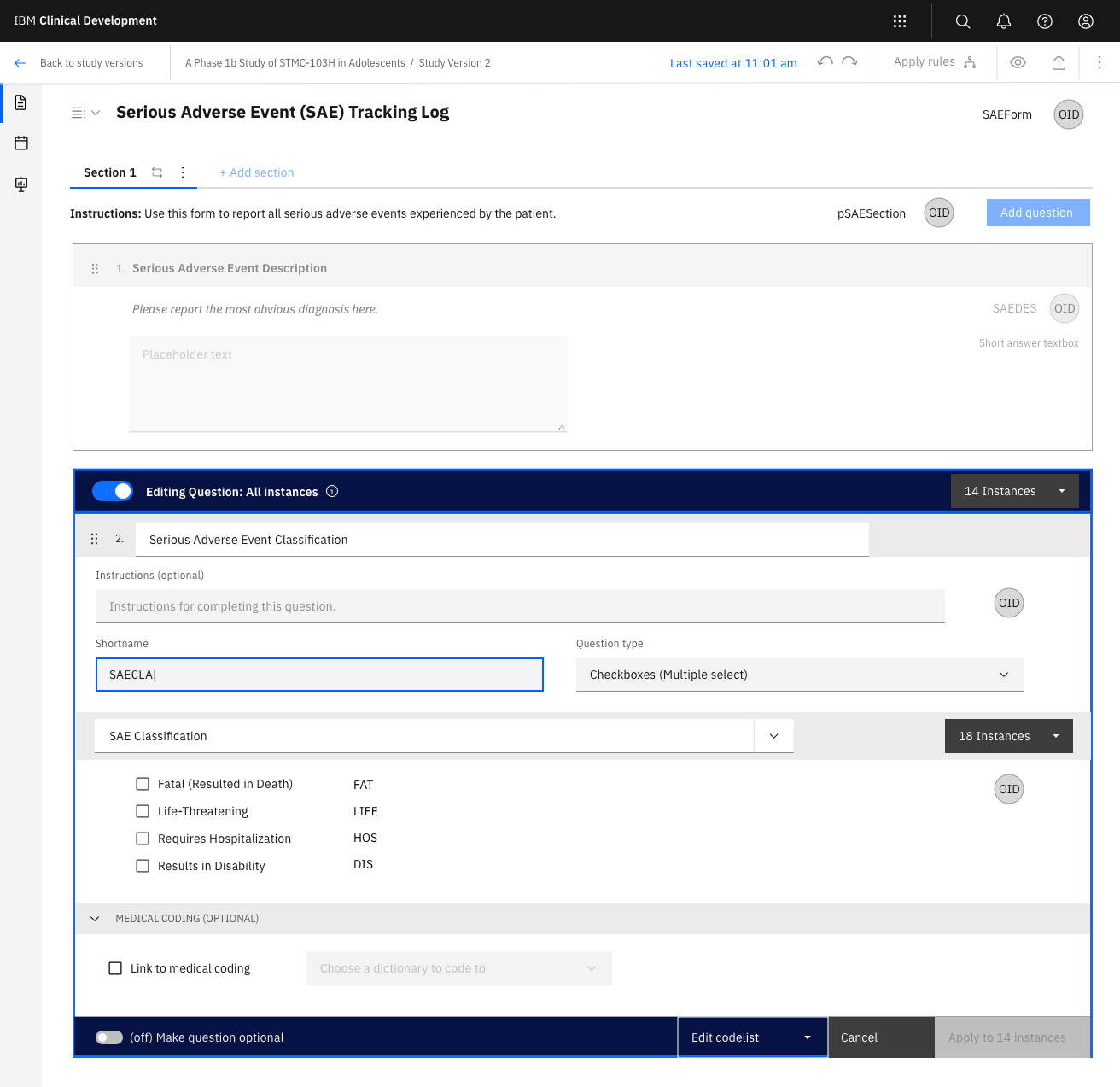
✅ Preferred option: Editing a codelist in context
🚫 Editing in a library
🚫 Editing in a new tab
🚫 Editing in a library
🚫 Editing in a new tab
✅ Preferred option: Editing a question in context
🚫 A hack-y workaround to editing a singular instance
Group affinity mapping synthesis
Chapter 6: The Birth of a Toggle
Huzzah, we had our edit strategy! And as with any moment of clarity, a new requirement came to light: if we have the option to edit all instances and a single instance, users must be able to switch between the options as much as they want before saving. A requirement fairly easily stated, but quite difficult to implement. After many iterations, sweat, and overwhlemed sketch files, we found a solution.
A toggle to switch between both edit modes so that users could have the flexibility to not make up their mind until they clicked save. So simple and it was scalable!
Now we can focus on polishing the visual design...
Oh and one more thing - while only editing in a library didn’t test well, we still need to have a library for users to reference.
And back to the sketch file...


Variations on edit
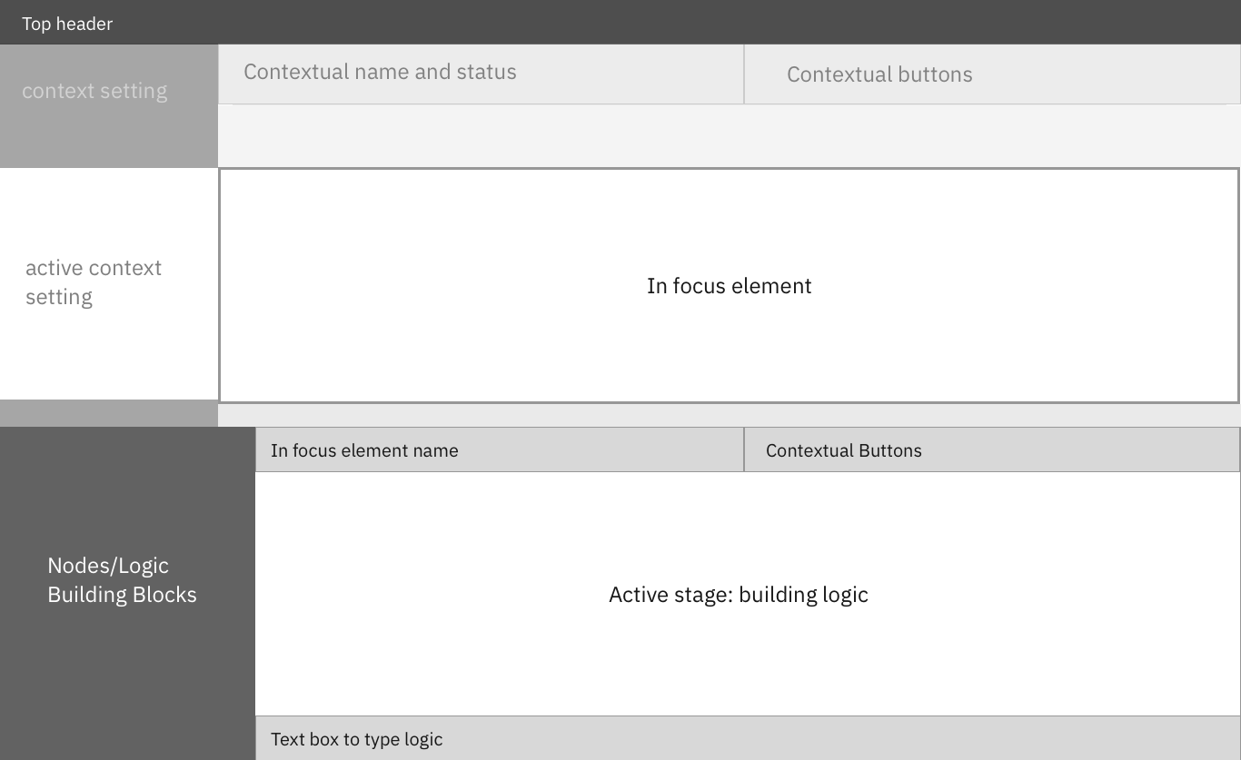
Design here of the chosen path
But evenually, we had all the major components of form building and were able to finalize the visuals and content. And with those changes, our partners needed the data from user feedback to keep moving forward. Was it difficult and time consuming to conduct these studies? Yes, but it was absolutely worth it because it built trust in the team and confidence in our decisions.
In the End (Finally)
After two full requirements rewrites, three and a half full redesigns (with many iterations inbetween), and four rounds of usability tests, we finally had a form building process that the entire team was confident in. To be honest, it was a difficult process. There was a lot of pressure riding on the designs since form building is a crucial part of the experience. And there was pressure on how I was building the relationship between design and the cross functional team. At times, it felt like the issues we had defied all logic. But I learned that those moments were a sign that there was some kind of miscommunication; that we needed to take a step back, listen for what wasn’t explicitly said, and address those concerns. Due to the nature of having so many nested entities, systems thinking was required for every aspect of the design; I had to constantly keep an eye on an individual tree without losing sight of the forest. My mantra became: “Can the strategy scale? Why is it acceptable for it not to scale?”. These experiences helped me become not only a better deisgner and collaborator, but also more resilient and empathetic leader.
Redesigning the Information Architecture
MY OBJECTIVE:
AT THE SAME TIME:
Story:
1. initial investigation
2. redesigning
3. testing
4. final iteration
5. used as a tool for alignment -- impact
AT THE SAME TIME:
Story:
1. initial investigation
2. redesigning
3. testing
4. final iteration
5. used as a tool for alignment -- impact
Impact:
used as a tool for alignment
used as a tool for alignment
Domain Deep Dive
MY OBJECTIVE:
To rapidly build a deep understanding of the study building and conduct stage of clinical trials.
AT THE SAME TIME:
Study Designer Research
Process Building
Form Building
![]()
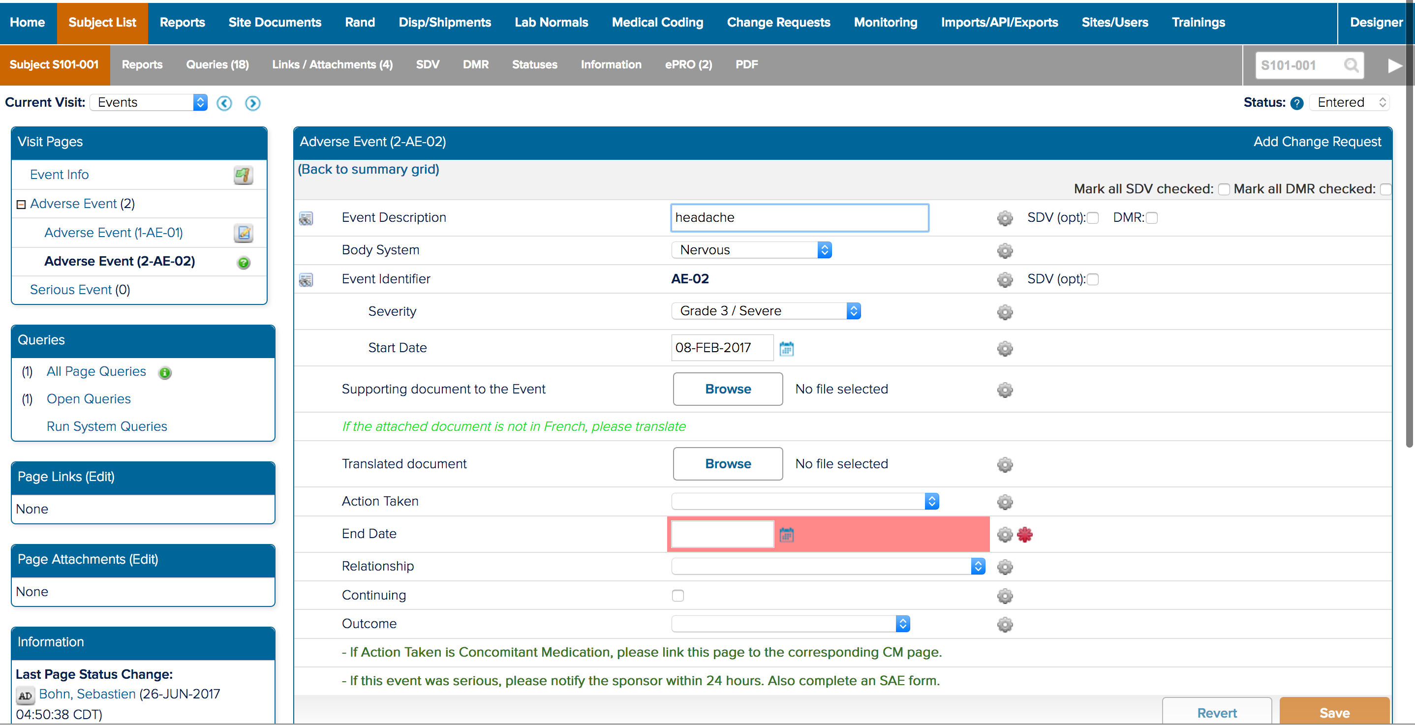
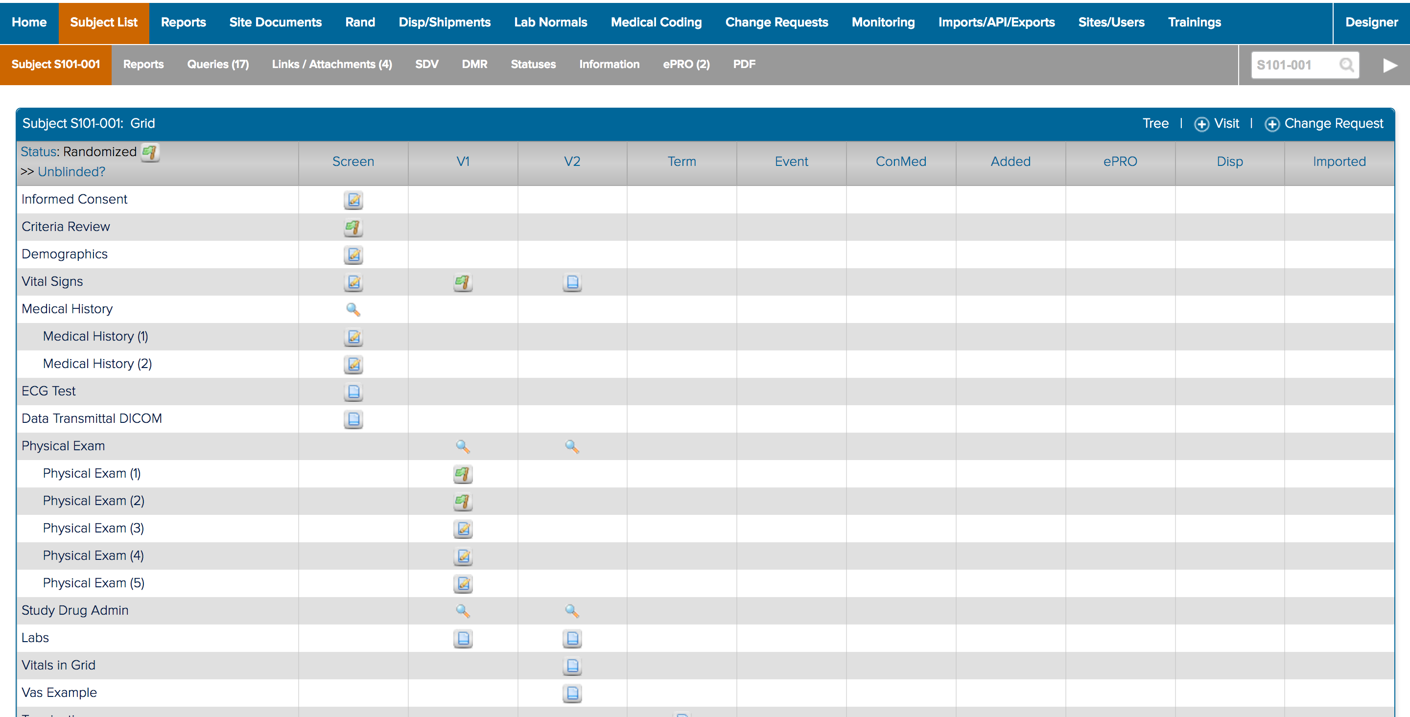
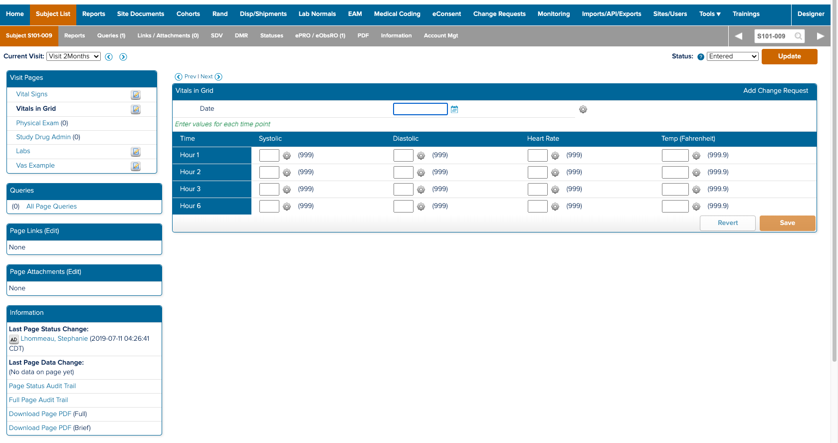
![]() The study designer side of a form and how it appears in study conduct
The study designer side of a form and how it appears in study conduct
To rapidly build a deep understanding of the study building and conduct stage of clinical trials.
AT THE SAME TIME:
Study Designer Research
Process Building
Form Building
Spoiler:
I am the design team’s go to person for questions concerning building and deploying clinical trials. And that’s not because I’ve been on the product the longest; it’s because I demonstrated within the first four months that I could build my understanding so that I understood the space as well as my cross functional partners. Demonstrating that I wanted and was able to understand all the details and decisions, built the team’s confidence in the design work presented later on. My expertise enabled me to educate seven team members about the space and document my learnings as a reference for the team.
In the beginning...
When I first started working on IBM Clinical Development, I had just begun to understand the definition of life scienes. To say that I started from nothing would not be an exaggeration. I knew that I needed to change my knowledge deficit fast, especially since I had to start on designs and research immediately. On top of that, I knew that the method, depth, and velocity of building domain knowledge would play a crucial role in developing trust with my new cross functional partners. Otherwise how could I expect them to trust any design decision, regardless of how well I explained it, if they didn’t have the confidence that I understood the space they worked in for their entire careers?
The How:
I started by organizing weekly knowledge share sessions with the design and cross functional team. Since the legacy product was extremely feature and setting dense, each session we could cover only a very small portion of the product. I would ask questions on every little detail: what was the original need, why was it implemented in that way, did it really require this much customization, what do our users think, did it successfully solve for the need, and so on.
Doing this enabled me to begin to see the intricacies of study building process, how a study is structured, and the workflow processes in the perphery that enable a study to run smoothly.
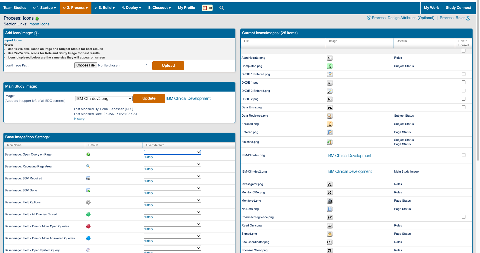
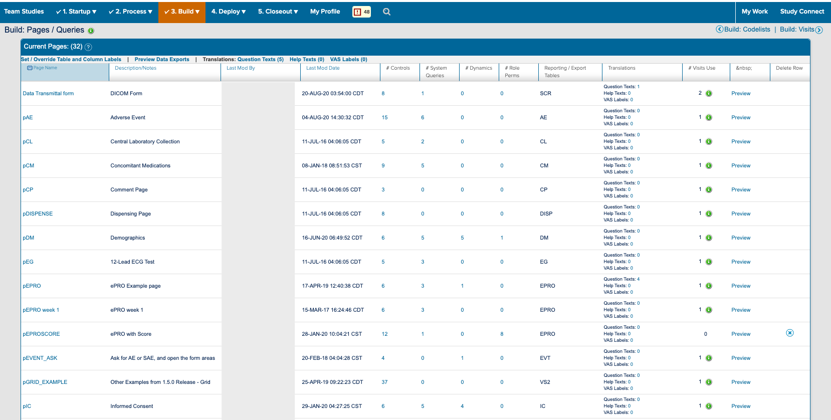
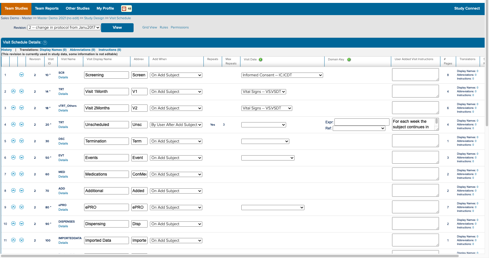
I also spent a significant amount of time building and deploying my own studies. Not only to experience what users did, but to also better understand the system. ICD is a highly customizable tool where everything you see on the study conduct side of the tool is a result of a setting in the study designer side. Beyond the forms for data collection; the navigvation, page titles, and even the iconography were all customizable and differed between studies. In order to truly understand the consquences of an action, I had to track it across both the study design and study conduct sides of the tool.
What’s the big deal?
The result was that these efforts formed the foundation of design team’s understanding of ICD. It enabled me to explore the product with intention and identify key areas to discuss with users. I was able to thoroughly and quickly build domain knowledge so that I could teach two consulting team members about the space and eventually onboard five more. And further down the road when we presented new designs, the cross functional team knew that our work had a sound foundation and better trusted it.
I started by organizing weekly knowledge share sessions with the design and cross functional team. Since the legacy product was extremely feature and setting dense, each session we could cover only a very small portion of the product. I would ask questions on every little detail: what was the original need, why was it implemented in that way, did it really require this much customization, what do our users think, did it successfully solve for the need, and so on.
Doing this enabled me to begin to see the intricacies of study building process, how a study is structured, and the workflow processes in the perphery that enable a study to run smoothly.
I also spent a significant amount of time building and deploying my own studies. Not only to experience what users did, but to also better understand the system. ICD is a highly customizable tool where everything you see on the study conduct side of the tool is a result of a setting in the study designer side. Beyond the forms for data collection; the navigvation, page titles, and even the iconography were all customizable and differed between studies. In order to truly understand the consquences of an action, I had to track it across both the study design and study conduct sides of the tool.
What’s the big deal?
The result was that these efforts formed the foundation of design team’s understanding of ICD. It enabled me to explore the product with intention and identify key areas to discuss with users. I was able to thoroughly and quickly build domain knowledge so that I could teach two consulting team members about the space and eventually onboard five more. And further down the road when we presented new designs, the cross functional team knew that our work had a sound foundation and better trusted it.